


After an extensive amount of build-up, Yahoo has finally unveiled its brand new logo.
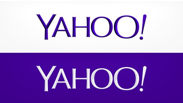
Overall the look is cleaner and thinner, and it is a new sans-serif typeface created by Yahoo. The logo is still purple, though a shade darker, and features all the usual uppercase letters in the same order finished off by the signature enthusiastic exclamation point, which dances around in some versions. The new logo is probably not different enough to raise much ire (or eyebrows) among regular visitors.
Yahoo posted two flavors of the new look to its Tumblr at midnight on Thursday. One is white text on a purple background, the other purple text on white background. Both have a slight beveled effect, though it’s more noticeable on the purple text. It has already replaced the logo that appears on the top left corner of Yahoo.com.
“We wanted a logo that stayed true to our roots (whimsical, purple, with an exclamation point) yet embraced the evolution of our products,” the company said on Tumblr.
Yahoo managed to turn a simple rebranding into an impressive marketing push by dragging it out for 30 days. For the past month, the company has rotated out the logo on its homepage daily with one of the runners up. Some of the 29 logos were a lot more unusual there than the final choice, perhaps to make fans appreciate the reserved simplicity of the final look.
“Sharing these logo variations prepares people for change, so there’s less risk of what happened to Gap,” said David Airey, a graphic designer specializing in brand identity.
When Gap tried changing its logo in 2010, there was an outcry among Gap loyalists and logo enthusiasts. The clothing company eventually caved and switched back to its old logo.
Yahoo’s logo redesign was headed up by an in-house brand design group and product designers, according to AdAge. It is likely just one of the more noticeable elements of a larger rebranding effort for the company.
“The logo is only part of a brand new branding and image campaign. It signals to consumers, investors and employees that change is coming,” said Columbia business school professor Bernd Schmitt.
On Twitter, the reaction to the logo was less than enthusiastic. “The new Yahoo logo looks like it got run through Alien Skin Eye Candy on Photoshop 4.0.,” said Justin Williams.
“A bad logo is all it took for Yahoo! to make everyone talk about it,” tweeted Preshit Deorukhkar, editor of design publication Beautiful Pixels.
Yahoo hasn’t updated its logo since 2009, and it has been mostly the same since 1995. The move to change it now is logical given its new CEO Marissa Mayer and her attempts to breath new life into the brand.
“More often than not, when a company’s identity looks a little tired (or more likely when new leadership wants to put their own stamp on things), what’s already in place won’t need to be thrown out. It’ll just need to be freshened up,” said Airey.
| Posted: at | |
 TRENDING GISTS
  Enzo Maresca Deal Is All But Done – Details of Chelsea’s New Manager Revealed
 Presidency Debunks Tinubu Will Address National Assembly May 29
 May Edochie Sorrowfully Recounts How She Used To Run Multiple Businesses Before
 Singer, Kizz Daniel Teases His Fans As He Shares Lovely Photos With Wife
 Canada-Based Nigerian BizWoman, Naomi Omolola Appointed Trade Commissioner In Toronto
 Soldier ‘Beat His 8 Month Old Daughter To Death Because She Wouldn’t Stop Screaming’